A comment was posted on the ARCart label art gallery which I posted about a few days ago:
I’ve wondered where the label logo comes from and what it actually depicts.
It’s over ten years since I created the logo, so I hope that any explanations I give are historically accurate and are not obscured by a somewhat foggy memory.
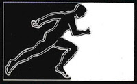
The logo is a silhouette of a man in a stretching position, which I crudely produced from a source image using a photocopier and possibly some software manipulation:
I wanted to use an image that conveyed something about humanity and its endeavours in a simple way. By that I mean that I didn’t want any sort of clichéd techno related symbology; no robots, no computers, no future XY-408 bla bla bla. While I have nothing against all that stuff, and although the music necessarily involved the use of machines, to me what we were doing was inherently human and I wanted to reflect that somehow. It’s not massively different to the original logo of Oliver Ho’s Meta label:
…which had been running for a couple of years prior to ARC’s launch, and on which my first record was released. While this wasn’t entirely deliberate it was not inappropriate that some kind of association was suggested. Both labels were being run out of the same flat, and of course the musical paths of the artists involved were very much intertwined.
2 replies on “the ARCart logo”
I always thought the logo was a nod to Jeff Mills’ Purposemaker logo, especially when yours is in the oval shape.
That’s what someone at my distributor told me too, but I didn’t really see it at the time. I mean, the oval is the only similarity, and it’s just a shape. Perhaps there was some subconscious influence but definitely not intended.